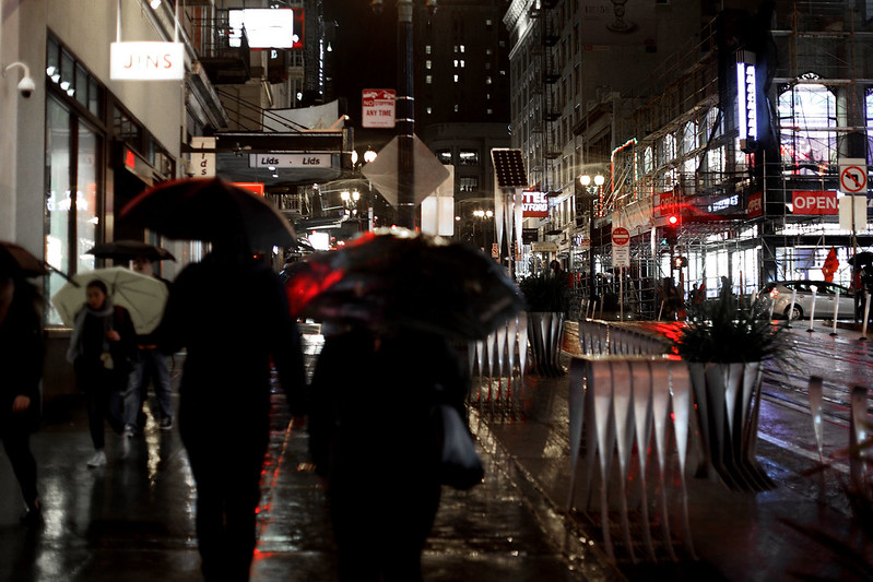
It definitely rained later in the evening.
[ <<previous | index | next >> ]
20:50
The weather has turned, with San Francisco blessing us with a bit of rainfall this evening. The forecast for today was morning showers, becoming steady rain in the afternoon and possible thunderstorms in the evening. The temperature was to be a slightly chilly 19°C, not too much cooler than the 23s and 24s of the past few days. The morning dawned with a patchy overcast which didn't look particularly rainy, and indeed the rain held off completely until late afternoon, with a few showers around 17:00, before settling into steady rain only after about 18:00.
After breakfast repeating the routine of yesterday, M. went out for a day exploring the Mission across to Castro, then over to Haight-Ashbury, before catching a bus back to the hotel. Her first planned stop was ImagiKnit, a shop Lisa suggested for buying knitting yarn, on the corner of 18th and Sanchez Streets. Here she bought a large ball of fancy multicoloured yarn for her mum to knit a beanie. She got back to the hotel about 15:30, not seeing a drop of rain all day.
 It definitely rained later in the evening. |
Meanwhile, I attended day three of the conference. The first Digital Photography talks began at 09:30, so I had time before them to attend a couple of talks in the Stereoscopic Displays and Applications session, which were fairly industry oriented and non researchy talks about applications of 3D displays. Then I moved to the Digital Photography room for a talk on photo editing on mobile phones. The speaker pointed out that some processing algorithms are so computationally intensive that it's hard to run them on a phone, so people thought cloud computing was the answer - upload your photos, process on a server, and download the result. The problem is uploading a full resolution image and downloading the result takes much longer than running the algorithms! So he proposed a solution where the phone compresses the photo heavily, to a hundredth or less the file size, using low quality JPEG at full resolution, upload that, have the server do a computationally heavy optimisation to produce a processing algorithm "recipe" for the photo based on this compressed version, and download this recipe to the phone for the phone to run on the high quality full resolution image. Although the recipe is optimised for the low quality JPEG, it works fine on the full quality image. This seems like a pretty clever idea to me.
After the coffee break, I went to the first two talks of the next Digital Photography session. One was about deblurring motion blur of moving vehicles by using two shots, one still and one tracking the vehicle using an image stabiliser system. The second was a clever way to produce artificial bokeh in wide depth-of-field images using a depth map by doing "pseudo" ray tracing to synthesise the image in an optically correct way. This produces depth dependent blur without the nasty edge effects often seen in such images processed by other methods. I've done research in this area myself, and I found this work to be very impressive. In fact it won the best student paper award.
Then I jumped sessions to the Human Vision conference to see a talk about individual differences in colour naming. Colour naming is a fascinating topic, with the classic work being the World Colour Survey performed over many years in which ethnolinguists surveyed members of populations of 145 different native languages around the world, to see what names they used to describe different colours. The famous result from this survey was that different linguistic cultures have different numbers of basic colour words that are generally agreed upon within that language grouping, and that they seem to fit into a sequence of increasing complexity.
Some languages only have two well defined colour terms, which correspond roughly to "light" and "dark". If you showed someone of that native language the colours light blue and light pink and asked them to name the colours, they would answer with the same word, the word meaning "light", and similarly if you asked them to name navy blue and brown, they would just use the word for "dark". Then there are languages with three colour terms, and invariably the additional term is one which encompasses red, with more or less broad boundaries that may also encompass oranges, yellows, and pinks. The next term added for languages with four colour terms is one which covers blues and greens. With five terms, blues and greens split, gaining a different term to distinguish them. At six terms, yellows get a different word to reds. And so on, until you reach English and several other European languages, which have up to eleven well defined basic colour terms: black, white, grey, red, green, blue, yellow, orange, purple, brown, pink. And there are almost no languages with more than this. English does have plenty of other colour words, like cyan, beige, apricot, morning mist, and so on, but the point is that these are not universally known among native English speakers - if you tell an English speaker cyan or beige or apricot, they might have only a vague idea what sort of colour you mean, or even none at all, whereas red and blue and yellow virtually every English speaker understands exactly what you mean.
So all of this has been well known for decades. The new thing these researchers did was to look at individual differences in colour naming - i.e. between individual people of the same culture. They got volunteers to sit with a colour chart of fifty or so colours and told them to give a unique name to each colour. So after exhausting the usual basic colours, they had to come up with names like peach or salmon or sea green to describe each colour. Then they took the names away, mixed them up, and gave them to a different volunteer and asked them to match the provided names to the colours on the chart. And the people failed to match what the original person had said, not just a little bit, but miserably. The next step was to give the scrambled colour names back to the same person who provided them in random order and ask them to identify the named colour on the chart. And they couldn't do it! Even identifying colours with the names they'd given themselves, they failed more often than they succeeded. Which shows that colour names beyond the basic eleven in English really are very arbitrary and not universally agreed upon at all.
 Lunch at Sabra Grill. |
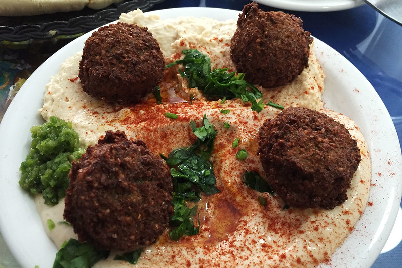
Following this talk I had lunch. I walked across to Grant Avenue and into Chinatown, thinking I'd find a sushi place or cheap Chinese, but I passed of all things a kosher restaurant, which advertised falafels. That sounded good, so I went in. It was called Sabra Grill and was up a flight of stairs to a small room with about ten tables in it. The staff and the four or five customers in there were all Jewish. The waiter pointed out a table and took my order of a plate of hummus with four falafels in a somewhat grumpy manner - he wasn't rude, but was taking his waiting tasks with a degree of boredom. He put some pickle pieces and a small pile of minced bright green vegetable on my table. After trying a pickle by itself I tried one with a bit of the green stuff, and found it to be very hot. Later I overheard a customer say it was jalapeños. Two thick pieces of hot pita bread arrived, followed by the hummus plate. I put the falafels into bits of bread, slathered with hummus and with bits of pickle and jalapeño for extra flavour. It was all delicious.
 Billboard seen on my lunch walk down Market Street. |
After eating, I went for a walk, down to Market Street, almost as far as the Embarcadero, then back along it to the hotel for the afternoon talks. The third plenary talk was from a guy from Intel, talking about Intel RealSenseTM technology, their project to add 3D sensing to computing hardware to enable all sorts of new interactions and capabilities. It was a bunch of marketing style stuff, really, bit it actually looked pretty neat, if they can realise some of the applications shown with the ease of use to make them workable.
After the coffee break was one of my favourite sessions. Every year the Colour conference has a session called "The Dark Side of Colour", which has a collection of talks about odd topics or things that don't work or glaring unsolved problems that everyone is ignoring, that sort of thing. This year was no exception, kicking off with a talk about the pigment cadmium red and the European Union's recent discussions on the possibility of banning it because of toxicity. The speaker said there was no effective replacement that wasn't more toxic, so artists were campaigning against the ban. I didn't really like her attitude: she was basically dismissive of any concerns. She mentioned the measured rise of cadmium concentrations in the environment, but then said, "it's probably caused by batteries, not artists' paint", but she failed to cite any evidence whatsoever other than her opinion. And she dismissed concerns that cadmium-based paints could get into sewers or soils through artists washing their brushes, by saying, "As if any artist would wash such an expensive material down the drain!"
 "How red is cadmium red?" - talk at Electronic Imaging. |
Next was an analysis of the best spectral distributions for white light sources, which concluded that there is no best spectrum, but that it depends strongly on what the illumination is used for, as homes, offices, shops, showrooms, museums, vehicle cockpits, etc all need different requirements for their "white" illumination.
Then was a discussion about printing anaglyphic (red-cyan) 3D images, and why typical computer printing pipeline colour management inevitably messes it up, producing significant levels of left-right crosstalk. Basically default print colour management mixes up the red and cyan channels to convert to CMYK pigment colour space for printing, and there's no way to override this in any standard computer operating system. So to print optimal anaglyphic images you basically have to write your own operating system and print colour management system.
The next talk was by a French colour researcher, who had collaborated with an artist, who was present along with some of her paintings. The paintings were attractive, colourful abstracts, somewhat reminiscent of Monet's impressionist works. The speaker talked about analysing the paintings using colour run length matrices, then let the artist speak, and she spoke about the feelings in her paintings and stuff like that. Then the speaker showed some histogram analyses of various paintings. It was all a bit disjointed and honestly I didn't get much out of it. After this was a talk by a Dutch guy about how there are no really good automatic image quality metrics, despite researchers publishing about 150 new ones every year, and why there probably never will be any that fulfil all the requirements of one.
 Data collection for the lipstick colour survey. |
And finally was another talk by the same French woman, who was working on a study sponsored by Chanel, to find out what lipstick colours people prefer, based on their nationality. To this end, she had survey forms out in the foyer with about fifteen different lipstick samples, asking people to record their nationality, age, sex, and lipstick preference: for females, what they would like to wear, and for males, "what colour would you enjoy seeing on a woman?" This was just the start of the project and she hoped to report the full results at this conference next year. During question time, several audience members suggested other potential factors such as age, clothing, and so on, and suggested improvements to the sampling methodology.
The conference done for today, I went back to the hotel room where M. had been reading since she returned a bit earlier. We rested a bit, then went out to dinner. It was raining steadily now, and M. used her umbrella, but I hadn't brought one so had to dash from cover to cover and just endure getting wet along the way. We walked over to Amber Indian restaurant, just off Market Street, which wasn't too far away. They said it would be a 40 minute wait for a table, and we discussed and decided we could wait. The guy asked for a phone number to text us when a table was ready, but we don't have phone roaming, so just said we'd wait there, taking a seat on a bench by the door. About ten minutes later the guy offered us a small table near the door, with bar stool chairs, so we took that.
 Vegetable korma and lentil dhal at Amber Indian. |
We ordered some samosas for starters, then a dhal of black lentils, and a vegetable korma, plus rice and a wholemeal roti. We also got a glass of Santa Barbara pinot noir each. The food was all good, the vegetable korma particularly so, with a slight spicy kick. The dhal was rich and creamy.
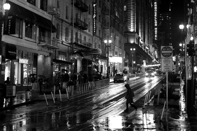
 Powell Street in the rain. |
On the way back, we stopped at the Ghirardelli shop on Stockton Street to buy a gift pack of chocolates for M. to share with her office. We had to pack as many chocolate squares as we could into the metal tin, which was awkward since it was dimensioned to leave nasty gaps too small to stuff another chocolate square into. After that we stopped in Walgreens to buy another pack of Grape Nuts, and also a small tub of Cherry Garcia ice cream for me to have as dessert. The rain eased just enough to allow some street photos in the wet night, before we dashed back to the hotel to shower and turn in.
[ <<previous | index | next >> ]