Archive for the ‘Photography’ Category

Up at Dawn

Tuesday, 30 March, 2010

The Swimmer
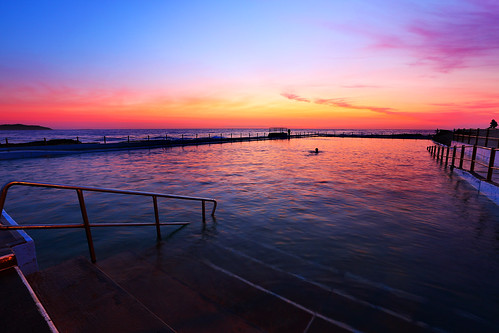
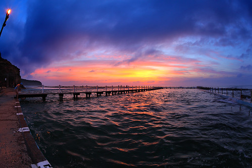
On Sunday I got up at 5:20. The aim was to be out at North Narrabeen while it was still dark, so I could do some sunrise photography. This is the best time of year to do this, because the sun is rising later as winter approaches, but daylight saving hasn’t ended yet, so the sun is actually appearing later (by the clock) than in the middle of winter. And being the tail end of summer, it isn’t nearly as cold in the morning either.

What you want for a good sunrise is a bit of cloud in the sky, but a clear horizon, without that band of grey wall you sometimes get hovering right on the horizon. If there’s no cloud, the sky just goes bland, but some clouds catch the red glow of the dawn sun and provide some contrast in the sky. The problem is, because you have to get up and head out when it’s still dark, you have no idea what the sky is going to be like when the sun finally appears. So it’s always a gamble. So far I’ve been very lucky with my dawn photo sessions – I haven’t really had a bad one yet.

The other thing is that I live on an east coast, which means that yes, I have to get up at dawn for the sunrise. The sun sets beyond the suburbs and the mountains in the distance, which isn’t nearly as good as the sun setting into the ocean. If you’re on a west coast, you get good sunsets; if you’re on the east, you need to go for the sunrises.

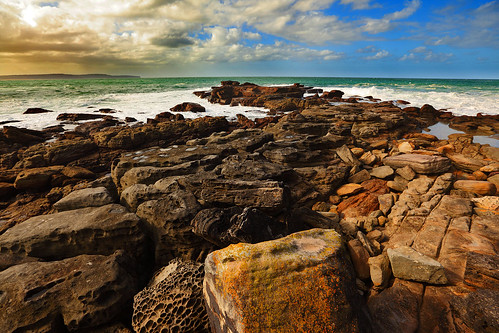
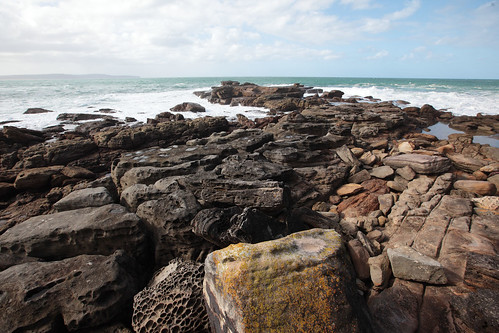
And finally, taking photos on the coast, you need to consider the tide. Yes, something I do cares about the phase of the moon. (And I’m not a fisher or a surfer. Actually, I used to care about the phase of the moon when I did astronomy too.) It happened to be high tide at dawn on Sunday, which meant much of the rock platform I was taking photos of was submerged. There were about half a dozen other photographers there – photography is a dawn fraternity – and all of them were simply wading through the sea water to access positions on the edge of the rocks, where waves could wash over them and provide luscious photos. I still need to get some shoes I’m willing to inflict sea water on, so I stayed on the relatively dry area around the rock pool.

Then there’s the choice of lens. I like to experiment and try unconventional things. One of the tricks is a fisheye lens. It distorts the image wildly, and is often used in ways which accentuate the effect, by including lots of obvious lines that get bent. But if you put the horizon bang in the middle of the frame, it stays straight. And if there are few straight lines elsewhere, the image can look reasonably natural. There is some obvious distortion in this shot, but it’s confined to the corners and doesn’t scream at you.

And the other cool thing about being here at dawn is that swimmers get up at the same time and provide interesting foreground subjects, to set against the magic that’s happening in the sky.

It’s good to get up early.

Digital post

Thursday, 25 March, 2010

The Oncoming Storm
What goes into making a photo? The simplistic answer is that you just record the light that enters the camera.

The problem with that is that a camera responds to light in a very different way to how the human eye and the human brain respond to light. If you pump the same number of photons of a certain wavelength into a camera at a certain position, they will hit the same pixel on the sensor (or the same position on a piece of film, if you’re old school) and be recorded in the same way. Give or take some random noise which is mostly insignificant. But if you pump the same number of photons of a certain wavelength into an eyeball, the human brain will process that signal very differently, depending on what else is around it in the image, how well adapted the eye is to the present illumination level, the presence of strong light sources or colours elsewhere in the visual field, and so on.

This causes the common phenomenon of seeing something spectacular – a sunset is a good and common example – and taking dozens of photos of it because, well, it’s just so amazing! But then when you look at the photos later, they’re all kind of blah. They have a dark, almost black foreground, and a washed out sky and the colours aren’t nearly as vivid as you remember seeing. The camera isn’t lying – it just records what the light was actually doing. It’s your brain that that was lying at the time your eyes were seeing the sunset. The human visual system is wonderfully adaptive. It can make out details in extremely high contrast scenes that current cameras struggle, or fail, to deal with. That’s the first problem.

The second problem is that the physical objects we use to reproduce photos – prints or display screens – don’t have anywhere near the brightness contrast or the range of colours that humans can actually perceive. There are colours that you can see in real life that cannot be generated by a consumer-level display screen. The result of these two problems is that photos straight off a camera sensor often bear only a superficial relation to the contrasts and colours we saw when we took the photo.

This problem is addressed by post-processing. This is not a new thing associated with digital photos. The old masters of film photography knew this, and used darkroom techniques to produce prints of images that were based on what was recorded on the negative, but were modified to give a better representation of how their eye remembered the image in the field. Dodging and burning (which some of you may be familiar with in digital image processing applications) began as darkroom techniques to alter contrast levels locally in a photograph. Ansel Adams, who created some of the most memorable black and white film images in the history of photography, used these techniques extensively. His photos were so striking and memorable and lifelike because he manipulated the data on the negatives to produce a print that the eye would recognise as close to what it would see in reality, rather than within the limited range of photographic film.

And the same principle applies to digital photos. The JPEGs you get out of digital cameras are processed to adjust the contrast levels and colour saturation so that when you display the image it looks roughly how it looked in reality. This is done automatically for the most part, with most people blissfully unaware. It’s only if you examine the raw image data off the sensor that you notice how different it is to what the scene should look like. And if you are an advanced level digital photographer and manipulate raw images and process them yourself to produce nice-looking results, you know this, and that some judicious tweaking can produce much more pleasing photos.

The point of this is that digital post-processing is often seen as “cheating” somehow, making the photo into something it never was. It can be that, certainly. But frequently some post-processing is needed simply to make a photo as recorded more closely match what we saw with our eyes when we decided to take the shot.

Oncoming Storm: original
When I saw this photo (right) in my collection after a trip to the beach, my first thought was, “Bleah, how dull. Why did I even take that shot?” But I loaded it up into Photoshop and played around a bit. I’m not claiming the shot at the top of this post is a perfect representation of what I saw with my eyes (being displayed on a screen, it never can be), but it’s definitely a closer match to what my brain told me I was looking at when I decided to take the photo.

I’m sure some people will claim they prefer the “unprocessed” version, saying the processed one looks “too fake”. Fine. I think it better represents what I saw that day. It is perhaps a little more enhanced for dramatic effect, but that’s also part of what makes photography an art form, rather than just a mechanical process. I can make a decision on how to present the photo, knowing that no way that I can present it actually matches the experience of being there.

The point here is that digital post-processing of photos shouldn’t be looked down upon as “messing with reality”. The image as recorded in the camera is already “messed with”. What you can do is take that data and turn it into something you want to look at and that reminds you of what you saw – in your mind – when you took it. And isn’t that what photography is about?

Apertures

Thursday, 11 March, 2010

Someone asked me today why the aperture number on a camera lens gets bigger as the aperture size gets smaller. Some of you no doubt already know why. But for anyone who’s ever wondered the same thing (as I did for many years when I first started using an SLR camera back in the days of film), let me explain.

The aperture is the number you see written as f/2.8 or f/8 or f/22. It describes the size of the opening inside the lens through which the light passes. There’s an iris diaphragm which can open and close to let in different amounts of light. This is useful to control for two reasons:

  1. The wider the aperture, the more light you let in to expose your film or digital camera sensor. So in dim light, it’s often better to use a wider aperture. Conversely, in bright sunlight, you can use a narrower aperture to get the same exposure at the same shutter speed.
  2. The wider your aperture the narrower your depth of field. This is a measure of the range of distances from your camera within which objects will be in focus. If your depth of field is large, lots of stuff will tend to be in focus, while if it’s narrow, only objects a precise distance from the camera will be in focus and everything else will be blurry. This might sound bad, but in many cases you want a shallow depth of field, such as to make a flattering portrait of someone – it looks better if things in the background are blurry so as not to distract your eye from the subject of the photo. So a portrait photographer will tend to use a wide aperture. On the other hand, a large depth of field is good for landscape photography, where you want everything in focus, so a landscape photographer would tend to use a narrow aperture.

The interesting thing is that to a beginner in photography the numbers of the apertures might seem to be backwards. f/2.8 is a wide aperture, letting in a lot of light, while f/22 is a narrow one, letting in relatively little light. Why is this?

The answer lies in the mysterious “f/” that precedes the aperture number. Although people usually refer to the apertures as “eff two point eight” or “eff twenty-two”, the slash symbol is actually a division sign. The f is the symbol for the focal length of the lens. If you have a standard 50mm lens, the aperture f/2.8 is 50/2.8 = 17.9mm wide. And the aperture f/22 is 50/22 = 2.3mm wide. So you see f/2.8 is quite a bit wider than f/22.

The interesting thing is that the apertures are defined in terms of the focal length of the lens. If you have a 200mm telephoto lens, then f/2.8 is 200/2.8 = 71mm wide and f/22 is 200/22 = 9.1mm wide. So in a physical sense the “same” aperture numbers are actually physically bigger on a longer lens, and physically smaller on a shorter lens.

So you might expect f/2.8 on a 200mm lens to let in more light than f/2.8 on a 50mm lens. But this isn’t the case. The 200mm lens has a field of view 4 times smaller than the 50mm lens – in other words it magnifies things by 4 times compared to the 50mm lens. After all, this is why you use a telephoto lens, to make things look bigger and closer! But the field of view being 4 times smaller means that the lens is gathering 16 times less light (it’s 4 times smaller in the horizontal direction and 4 times smaller in the vertical direction, so it sees an area 16 times smaller). But then the aperture f/2.8 on the 200mm lens is 4 times bigger than the aperture f/2.8 on the 50mm lens, so it gathers 16 times as much light (again, 4 times bigger horizontally, multiplied by 4 times bigger vertically = 16 times the area). So the physically larger aperture exactly cancels the fact that the lens is only seeing a smaller area of the image. The result is that aperture f/2.8 on a given lens gathers exactly the same amount of light as aperture f/2.8 on any other lens! (Assuming an evenly lit subject.)

So that’s why lens apertures are specified in this way. Rather than say the aperture is 5mm, or 13mm, or whatever, it’s much more convenient for figuring your exposure to express the aperture as a fraction of the focal length of the lens. Which explains the odd-looking “f/” notation, and why the numbers get bigger as the aperture gets smaller.

Portrait of Audrey

Thursday, 25 February, 2010

Audrey Hepburn by Michael Ochs Archives, copyright Getty Images
This is a great photo. No, I didn’t take, I only wish I had.

Besides the fact that the subject is Audrey Hepburn, and therefore it would be difficult to take a bad photo, this shot in particular is awesome. I came across it because my wife buys a fancy picture calendar every year, and for 2010 she chose to get one with portraits of Audrey Hepburn. So for the month of February I’ve had this gorgeous photo looking at me from the kitchen wall. With a quick flip through, I determined that none of the other photos in the calendar are as good as this one.

I don’t consider myself a very good portrait photographer. I prefer subjects that don’t move around, like buildings and trees and stuff. If I do take shots of people, they’re mostly candids of strangers, simply engaged in whatever they would be doing anyway, as part of an overall scene. I know good portrait photography when I see it, and appreciate seeing it, but I find it difficult doing it myself.

Focus on the eyes, capture an expression, don’t have the subject stare into the camera. Knowing the rules is the easy part. A portrait is a moment in time when you have to capture the essence of a person in a single still image. I don’t know what Audrey is looking at in this shot, but she’s happy and natural and her eyes are clear and bright. There’s a bit of a tilt to the image to give it some informality. The perspective is fairly flat, indicating a mild telephoto lens was used to avoid exaggerating depth features (producing a bulging nose, for example) – although this is standard practice for portraiture and any photographer should know this. The subject fills the frame, leaving no doubt that this is a photo of a person, not what the person is doing or where the person is. The lighting is soft and flattering, with no heavy shadows on any side, but there are sparkles in her eyes. This is difficult to achieve without a professional studio lighting rig. The background is nicely blurred and non-distracting.

Yes, it’s a beautiful photo of a beautiful woman, but technically it’s an absolutely drool-worthy piece of photography. I hope to make a portrait half as good as this one day.

(Photo by Michael Ochs Archive, copyright by Getty Images. Low resolution version included here for editorial and critical review purposes only.)

Getting up before dawn

Sunday, 21 February, 2010

Fire and Water
This is the right time of year to get up before dawn and take photos of the sunrise. The sun is rising later as autumn approaches, but we haven’t shifted the clocks back to compensate yet, and the pre-dawn air is still not too chilly. The last two weekends however it was pouring with rain, so I caught up on sleep instead.

Not today, however! We got up at 05:10, gulped down enough food to tide us over until a proper breakfast, and drove out to Dee Why beach and ocean baths. Traffic is really good this early on a Sunday morning! We arrived just before 06:00, a good half hour before sunrise.

Although ocean baths are very photogenic, the problem for dusk photography is that all the ones in the Sydney area are lit by sodium lamps. The ghastly yellow colour plays havoc with your colour balance. I took a few shots with the pool and surrounds in the foreground and the dawn colours on the horizon, but the better shots largely skip the areas close to the sodium lamps. Undeterred by this challenge, two other guys had arrived even earlier than us and were staking out prime territory with their tripods and cameras. As the morning progressed, we gave each other nods, but didn’t stop to chat – there was much more important stuff to do!

After a while, as the sky turned on a gorgeous light show, the first swimmers began to arrive. It’s almost always retiree-aged people who hit the water at the crack of dawn. That’s pretty cool. When I retire, I’m planning to take a sunrise swim every morning. If I’m not out taking photos that is. Because dawn really is the best time of day to take pictures. The light is wonderful, and somehow it always feels fresher and more vibrant than a sunset at the end of a day, when the light is kind of worn out. I know that doesn’t make a whole lot of sense, but it’s true – for some reason sunrise just is more beautiful than sunset. Anyway, it’s good to get out and exercise the shutter finger a bit. As with everything else, I never have enough time to do all the photography I want to do. But sacrificing a sleep-in for a sunrise is well worth it. More photos from this morning here.

After the sun started climbing into the sky, we headed to a nearby cafe for the decadence of a bought breakfast. To me, breakfast is a simple meal you eat at home. The idea of going out and buying breakfast still smacks of overindulgent luxury to me. Which is why I enjoy it on the very rare occasion we do it! Mmm… poached eggs, bacon, hollandaise sauce… And by 08:00 we’d finished this excellent breakfast, witnessed a gorgeous sunrise, got some exercise, taken some (hopefully) good photos, and we still have the whole Sunday ahead of us! Getting up early rocks!