Archive for March, 2010

Up at Dawn

Tuesday, 30 March, 2010

The Swimmer
On Sunday I got up at 5:20. The aim was to be out at North Narrabeen while it was still dark, so I could do some sunrise photography. This is the best time of year to do this, because the sun is rising later as winter approaches, but daylight saving hasn’t ended yet, so the sun is actually appearing later (by the clock) than in the middle of winter. And being the tail end of summer, it isn’t nearly as cold in the morning either.

What you want for a good sunrise is a bit of cloud in the sky, but a clear horizon, without that band of grey wall you sometimes get hovering right on the horizon. If there’s no cloud, the sky just goes bland, but some clouds catch the red glow of the dawn sun and provide some contrast in the sky. The problem is, because you have to get up and head out when it’s still dark, you have no idea what the sky is going to be like when the sun finally appears. So it’s always a gamble. So far I’ve been very lucky with my dawn photo sessions – I haven’t really had a bad one yet.

The other thing is that I live on an east coast, which means that yes, I have to get up at dawn for the sunrise. The sun sets beyond the suburbs and the mountains in the distance, which isn’t nearly as good as the sun setting into the ocean. If you’re on a west coast, you get good sunsets; if you’re on the east, you need to go for the sunrises.

And finally, taking photos on the coast, you need to consider the tide. Yes, something I do cares about the phase of the moon. (And I’m not a fisher or a surfer. Actually, I used to care about the phase of the moon when I did astronomy too.) It happened to be high tide at dawn on Sunday, which meant much of the rock platform I was taking photos of was submerged. There were about half a dozen other photographers there – photography is a dawn fraternity – and all of them were simply wading through the sea water to access positions on the edge of the rocks, where waves could wash over them and provide luscious photos. I still need to get some shoes I’m willing to inflict sea water on, so I stayed on the relatively dry area around the rock pool.

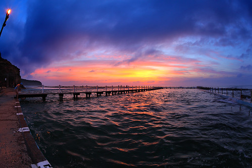
Then there’s the choice of lens. I like to experiment and try unconventional things. One of the tricks is a fisheye lens. It distorts the image wildly, and is often used in ways which accentuate the effect, by including lots of obvious lines that get bent. But if you put the horizon bang in the middle of the frame, it stays straight. And if there are few straight lines elsewhere, the image can look reasonably natural. There is some obvious distortion in this shot, but it’s confined to the corners and doesn’t scream at you.

And the other cool thing about being here at dawn is that swimmers get up at the same time and provide interesting foreground subjects, to set against the magic that’s happening in the sky.

It’s good to get up early.

Jessica’s Botrytis Semillon 2008, McLeish Estate

Saturday, 27 March, 2010

Wine & Cheese
Last year we went away for a long weekend in the Hunter Valley. It’s one of Australia’s great wine regions, and only a couple of hour’s drive from home. One of the wineries there is McLeish Estate, which is owned by a friend’s uncle. So of course we popped in for a look around and to taste some of the wines. I bought a bottle of shiraz for a gift and a bottle of this – Jessica’s Botrytis Semillon dessert wine.

Sweet dessert wines are one of my favourite things, even before I started this recent discovery of wine. We tasted this one at the end of our trip, after tasting a bunch of other wines – dry and sweet – and I recall being somewhat unimpressed, but perhaps it was just a jaded palate by that stage.

Trying it again now, it’s a delicious syrupy wine, honey sweet with a tang of oranges and a slight prickliness of fermentation. I think I detected a hint of peach in there too. As it swirls in the mouth, a balanced bitterness of orange peel comes out – not a bad thing at all, since it nicely complements the intense beginning sweetness, toning it down. Think the elegant sophistication of dark chocolate as opposed to the simple sweetness of milk chocolate.

We had it with a selection of cheeses, crackers, and sliced pear. Yum!

Digital post

Thursday, 25 March, 2010

The Oncoming Storm
What goes into making a photo? The simplistic answer is that you just record the light that enters the camera.

The problem with that is that a camera responds to light in a very different way to how the human eye and the human brain respond to light. If you pump the same number of photons of a certain wavelength into a camera at a certain position, they will hit the same pixel on the sensor (or the same position on a piece of film, if you’re old school) and be recorded in the same way. Give or take some random noise which is mostly insignificant. But if you pump the same number of photons of a certain wavelength into an eyeball, the human brain will process that signal very differently, depending on what else is around it in the image, how well adapted the eye is to the present illumination level, the presence of strong light sources or colours elsewhere in the visual field, and so on.

This causes the common phenomenon of seeing something spectacular – a sunset is a good and common example – and taking dozens of photos of it because, well, it’s just so amazing! But then when you look at the photos later, they’re all kind of blah. They have a dark, almost black foreground, and a washed out sky and the colours aren’t nearly as vivid as you remember seeing. The camera isn’t lying – it just records what the light was actually doing. It’s your brain that that was lying at the time your eyes were seeing the sunset. The human visual system is wonderfully adaptive. It can make out details in extremely high contrast scenes that current cameras struggle, or fail, to deal with. That’s the first problem.

The second problem is that the physical objects we use to reproduce photos – prints or display screens – don’t have anywhere near the brightness contrast or the range of colours that humans can actually perceive. There are colours that you can see in real life that cannot be generated by a consumer-level display screen. The result of these two problems is that photos straight off a camera sensor often bear only a superficial relation to the contrasts and colours we saw when we took the photo.

This problem is addressed by post-processing. This is not a new thing associated with digital photos. The old masters of film photography knew this, and used darkroom techniques to produce prints of images that were based on what was recorded on the negative, but were modified to give a better representation of how their eye remembered the image in the field. Dodging and burning (which some of you may be familiar with in digital image processing applications) began as darkroom techniques to alter contrast levels locally in a photograph. Ansel Adams, who created some of the most memorable black and white film images in the history of photography, used these techniques extensively. His photos were so striking and memorable and lifelike because he manipulated the data on the negatives to produce a print that the eye would recognise as close to what it would see in reality, rather than within the limited range of photographic film.

And the same principle applies to digital photos. The JPEGs you get out of digital cameras are processed to adjust the contrast levels and colour saturation so that when you display the image it looks roughly how it looked in reality. This is done automatically for the most part, with most people blissfully unaware. It’s only if you examine the raw image data off the sensor that you notice how different it is to what the scene should look like. And if you are an advanced level digital photographer and manipulate raw images and process them yourself to produce nice-looking results, you know this, and that some judicious tweaking can produce much more pleasing photos.

The point of this is that digital post-processing is often seen as “cheating” somehow, making the photo into something it never was. It can be that, certainly. But frequently some post-processing is needed simply to make a photo as recorded more closely match what we saw with our eyes when we decided to take the shot.

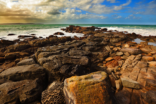
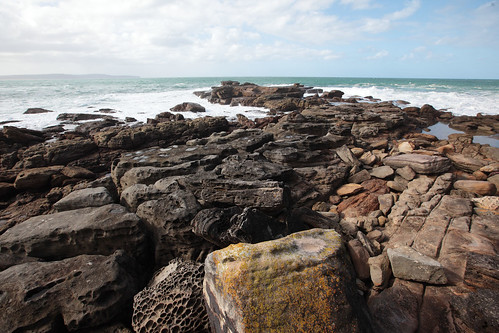
Oncoming Storm: original
When I saw this photo (right) in my collection after a trip to the beach, my first thought was, “Bleah, how dull. Why did I even take that shot?” But I loaded it up into Photoshop and played around a bit. I’m not claiming the shot at the top of this post is a perfect representation of what I saw with my eyes (being displayed on a screen, it never can be), but it’s definitely a closer match to what my brain told me I was looking at when I decided to take the photo.

I’m sure some people will claim they prefer the “unprocessed” version, saying the processed one looks “too fake”. Fine. I think it better represents what I saw that day. It is perhaps a little more enhanced for dramatic effect, but that’s also part of what makes photography an art form, rather than just a mechanical process. I can make a decision on how to present the photo, knowing that no way that I can present it actually matches the experience of being there.

The point here is that digital post-processing of photos shouldn’t be looked down upon as “messing with reality”. The image as recorded in the camera is already “messed with”. What you can do is take that data and turn it into something you want to look at and that reminds you of what you saw – in your mind – when you took it. And isn’t that what photography is about?

Ripe, Fruity, with a Hint of Carbon-14

Tuesday, 23 March, 2010

A story combining wine and nuclear physics… How could I not mention it here?

A group from the University of Adelaide have examined the carbon-14 content of Barossa Valley wines of authenticated vintages ranging from 1958 to 1997. They find a significant correlation between the vintage and the carbon-14 count, strong enough to allow them to date an unknown vintage correctly in a blind test to within a year.

The C-14 levels vary over the timespan tested because of relic atmospheric radiation from open-air atomic testing in the post-WWII years. The proportion of C-14 gets absorbed by the grapes and ends up in the wine. This “bomb pulse” dating technique has been known for some time, but it’s the first time it’s been applied to dating wine vintages.

Lest this be considered a trivial application of science, remember that top end vintage wines are big business. There is concern over forgery or adulteration of expensive wines, and this technique can be used on very small samples to either verify a wine’s vintage or detect tampering. Science to the rescue!

A reference to the original research publication can be found here. Apparently it was published in 2004, so I don’t know why the SMH decided to pick this up and run it as a story today.

Evans & Tate 2007 Margaret River Merlot

Sunday, 21 March, 2010

Evans & Tate 2007 Margaret River Merlot
We wanted to try a merlot from Chile, and the local wine shop has a selection of imported wines in a nook at the back, including some from Chile. Unfortunately, when we went in and had a look, everything from Chile was either malbec or carménère. I didn’t remember anything about these varietals from my reading, so we asked the woman at the counter what they were like. I figured she’d have a good idea, but alas she had no experience with these wines and could only give us an, “I think they’re a bit like cab sav.”

I thought this was a bit disappointing for someone working in a specialty wine shop (as opposed to a more generic liquor shop, this place doesn’t sell beer or spirits, just wines). The upshot was we decided not to risk it this time and went for a merlot from Western Australia instead. There’s a lot of choice if you stick within Australia, so we semi-randomly grabbed this one, sitting in the middle of the price range.

Evans & Tate is a fairly big name brand in wines, and a gold medal – albeit as specialised as “best dry merlot” in the Royal Queensland Wine Show – promised it should be reasonable. We had it with a meal from a local Indian restaurant, with which it went reasonably well.

I have to say I’m finding it difficult to pull specific taste notes out of red wines in isolation – without contrasting styles of wine to compare against. I sniff, and then swill it around in my mouth, searching for a name to assign to the flavour, and I have trouble getting past “fruit” to anything more specific. I think this one had an aroma of cherries mixed in there, and honestly the only flavour note I got out of it apart from “fruity red wine” was a hint of liquorice at the end. It was pleasant, but nothing astounding.

More practice needed!

Abstraction

Tuesday, 16 March, 2010

In many fields, there is certain level of abstraction you need to do with your knowledge in order to apply it at a more advanced level.

As an example, consider computer programming. The most basic level is manipulating variables and control flow with branches and loops. A level of abstraction comes when you write callable functions to encapsulate repeated tasks. There’s another level when you learn about pointers and references. And then you can fling around references to functions and pass those in as parameters to other functions. Further abstraction comes with function templating, design patterns, and so on. And at some point you get to wrangling large chunks of code that are standardised enough that you can write other code to generate those chunks of code from some sort of code definition files.

When you’re writing computer code whose purpose is not to calculate some value, but to generate other computer code, then you’ve climbed a fair way up the abstraction pyramid.

I used to have a job cutting code. I’m a competent programmer. But when the people around me started writing code to parse XML files into other, more complex code, I began feeling out of my depth. It was a level of abstraction too far for me to comfortably work with. I understand the concept of code generation, and can see the benefits, but actually doing it requires mental gymnastics that don’t quite come easily enough for me.

I’ve found I have similar trouble with more advanced mathematics. I’m fine with stuff that I can link directly to practical applications, like vectors and calculus to give simple examples. But these days I get thrown all sorts of matrix algebra and graph theory and classification trees and stuff which seems one layer too far removed from reality for me to fully comprehend. At some point along the way, I reached my abstraction threshold, and everything beyond that just seems like symbol pushing, with no underlying meaning.

I’m beginning to think that my strengths in the mathematical sciences lie not in the greater realms of abstraction, but in the solid application of what I know to the real world. I’m a visual person. I understand Fourier transforms and quantum mechanics and differential equations in an intuitive way, by thinking of them in terms of how they are represented by physical systems, and feeding that back in to figure out how the mathematics must behave. I don’t work from the mathematical equation manipulating and then map that on to the physical system.

Sometimes this seems like a limitation. Other people clearly have higher abstraction limits than I do, and are comfortable applying matrix operators in a purely mathematical way when they’re three or four steps removed from representing something, while I ask questions in their presentations about what it actually means. But maybe the lower abstraction threshold allows me to make deeper connections to describing physical systems, since many people have commented on my ability to describe complex scientific principles in terms that make them readily comprehensible. To me that just seems natural, as that’s the way I understand them. I need to see all those deep connections before I feel I really understand something.

Maybe that’s why I feel uncomfortable with higher abstraction. The connections are more tenuous, or fewer, and I feel like I’m working without a safety net, a reality anchor. In my heart I feel that the strong connections must be there, but they feel elusive, ghostly – and so I don’t feel that I fully understand what’s going on.

I don’t have a snappy conclusion to this line of thought. I only really thought about it last week, and I’m still digesting it and trying to see if it helps me. I think it might be the reason I have a breadth-first approach to knowledge. Any one field becomes more abstract as you learn more about it. If my abstraction threshold is lower than average (for science/research-minded people), it could explain why I diverge into looking at something different before I have an “expert” knowledge of any one subject.

Wild Oats 2006 Shiraz/Viognier

Sunday, 14 March, 2010

Wild Oats 2006 Shiraz/Viognier
We went out to Hugo’s at Manly (flash website) for dinner last night for my nephew’s birthday. My sister- and brother-in-law like shiraz, so this ended up being chosen from the wine list. The Wild Oats winery (more flash) is apparently run by the same people behind the Wild Oats yacht racing syndicate, which famously contests the Sydney to Hobart every year.

I was surprised to see a blend of shiraz and viognier. From my rudimentary experience, shiraz is a powerful, full-bodied, and very spicy red, while viognier produces tangy and florally aromatic whites. Of course mixing opposites sometimes produces amazing results. I don’t know if this was truly amazing, but a gold medal at a London wine show can’t be all that bad.

The spicy aroma of shiraz was muted and there was something else elusive and unidentifiable there. Complex and interesting, at any rate. The initial taste was of tart green fruitiness, slightly reminiscent of the sauvignon blanc I had a few weeks ago, and which was very surprising coming from a deep purple-red wine like this. The spiciness of the shiraz kicked in after a while, but it was restrained in strength, and always mixed with that surprising tartness. The typical peppery flavour was either absent or only at a very low level. There was a hint of dark plum.

All together, an eye-opening blend. It was complex with layered flavours and very enjoyable.

Fighting robots

Friday, 12 March, 2010

I do semi-regular Magic: The Gathering draft tournaments with friends. For anyone who doesn’t know, this involves getting packs of randomly sorted game cards and the drafting them, usually in the following fashion:

  1. Each player opens a pack of 15 cards and picks one card to keep and play the tournament with. The remaining cards are passed to the next player around the table (to the left, initially).
  2. Continue picking one card and passing the rest until everyone has 15 cards.
  3. Repeat for two more packs of cards, reversing the direction of passing each pack.
  4. Each player now has 45 cards, with which to construct a deck to play in the tournament. You typically use about 23 of the cards and add enough basic land cards from a common pool to total a deck size of 40.

So obviously choosing which cards to draft is an important tactical part of the overall tournament performance. It’s also a lot of fun in itself.

One of us had the idea to write a computer code framework to handle the administrative details, with an API that allows it to talk to other programs. Then each of us would write a program to make drafting decisions based on card details given to the program by the framework. We’d abstract a lot of the fiddly details out of the actual Magic cards and work with a much simpler system that basically gives certain card combinations scores based on properties of the cards. Then we’d run about 1000 drafts using the programs and analyse the statistics. The goal is to see which of our programs can draft a “better” deck in this system.

This was proposed to us in an e-mail, suggesting we might want to do this for something fun. The e-mail concluded with the following lines:

Pros:
* Creating robots to fight each other is always fun.

Cons:
* Complete waste of time.

I thought this was amusing… but also slightly inaccurate. After all, something this unutterably geeky should be a complete waste of time in order to be worth doing!

Anyway, since the proposal was made – less than 24 hours ago as I type – one of us has already written a framework program to enable this AI robot card drafting tournament. You can’t keep a good geek down! If we get some interesting results, I’ll be sure to share them.

Apertures

Thursday, 11 March, 2010

Someone asked me today why the aperture number on a camera lens gets bigger as the aperture size gets smaller. Some of you no doubt already know why. But for anyone who’s ever wondered the same thing (as I did for many years when I first started using an SLR camera back in the days of film), let me explain.

The aperture is the number you see written as f/2.8 or f/8 or f/22. It describes the size of the opening inside the lens through which the light passes. There’s an iris diaphragm which can open and close to let in different amounts of light. This is useful to control for two reasons:

  1. The wider the aperture, the more light you let in to expose your film or digital camera sensor. So in dim light, it’s often better to use a wider aperture. Conversely, in bright sunlight, you can use a narrower aperture to get the same exposure at the same shutter speed.
  2. The wider your aperture the narrower your depth of field. This is a measure of the range of distances from your camera within which objects will be in focus. If your depth of field is large, lots of stuff will tend to be in focus, while if it’s narrow, only objects a precise distance from the camera will be in focus and everything else will be blurry. This might sound bad, but in many cases you want a shallow depth of field, such as to make a flattering portrait of someone – it looks better if things in the background are blurry so as not to distract your eye from the subject of the photo. So a portrait photographer will tend to use a wide aperture. On the other hand, a large depth of field is good for landscape photography, where you want everything in focus, so a landscape photographer would tend to use a narrow aperture.

The interesting thing is that to a beginner in photography the numbers of the apertures might seem to be backwards. f/2.8 is a wide aperture, letting in a lot of light, while f/22 is a narrow one, letting in relatively little light. Why is this?

The answer lies in the mysterious “f/” that precedes the aperture number. Although people usually refer to the apertures as “eff two point eight” or “eff twenty-two”, the slash symbol is actually a division sign. The f is the symbol for the focal length of the lens. If you have a standard 50mm lens, the aperture f/2.8 is 50/2.8 = 17.9mm wide. And the aperture f/22 is 50/22 = 2.3mm wide. So you see f/2.8 is quite a bit wider than f/22.

The interesting thing is that the apertures are defined in terms of the focal length of the lens. If you have a 200mm telephoto lens, then f/2.8 is 200/2.8 = 71mm wide and f/22 is 200/22 = 9.1mm wide. So in a physical sense the “same” aperture numbers are actually physically bigger on a longer lens, and physically smaller on a shorter lens.

So you might expect f/2.8 on a 200mm lens to let in more light than f/2.8 on a 50mm lens. But this isn’t the case. The 200mm lens has a field of view 4 times smaller than the 50mm lens – in other words it magnifies things by 4 times compared to the 50mm lens. After all, this is why you use a telephoto lens, to make things look bigger and closer! But the field of view being 4 times smaller means that the lens is gathering 16 times less light (it’s 4 times smaller in the horizontal direction and 4 times smaller in the vertical direction, so it sees an area 16 times smaller). But then the aperture f/2.8 on the 200mm lens is 4 times bigger than the aperture f/2.8 on the 50mm lens, so it gathers 16 times as much light (again, 4 times bigger horizontally, multiplied by 4 times bigger vertically = 16 times the area). So the physically larger aperture exactly cancels the fact that the lens is only seeing a smaller area of the image. The result is that aperture f/2.8 on a given lens gathers exactly the same amount of light as aperture f/2.8 on any other lens! (Assuming an evenly lit subject.)

So that’s why lens apertures are specified in this way. Rather than say the aperture is 5mm, or 13mm, or whatever, it’s much more convenient for figuring your exposure to express the aperture as a fraction of the focal length of the lens. Which explains the odd-looking “f/” notation, and why the numbers get bigger as the aperture gets smaller.

Now what?

Tuesday, 9 March, 2010

A friend of mine recently completed a project he’d been working on for almost as long as I’ve known him. It started as a short film, for which I helped film some of the initial scenes back in, I think, 2006. The idea was pretty much fleshed out at that stage, and just needed filming and editing to put together.

Aside: Filming, by the way, is hard, hot, tiring work. A 30 second scene on film can take hours of work, interspersed by long periods of boredom while various things go wrong or need to be adjusted. And the work itself is repetitive – you don’t just act the scene or control the special effects once, oh no… you have to do it dozens of times until everyone gets it right at the same time. If you think actors have an easy and glamorous job, when it gets right down to what they actually have to do, think again.

Anyway, the project stalled. It was only with the imminent release of a song by this friend’s friend’s band that the film suddenly became highly relevant, as it happened to match the subject matter of the song nicely, and would make a great music video for it. So with a deadline of March this year, I and a bunch of other friends were drafted into more filming. Hard work, but fun when it was all over. For us anyway, because my friend then had to spend long hours at the editing program to cut things into shape.

The result is great: We All Wanna Drive Our Cars. As I said, don’t be fooled. This 3 and a half minutes of video took nearly 5 years, about 20 days of filming involving half a dozen or more people each time, and I hate to think how many hours of editing to put together. It’s a lot of work.

At one point my friend called this project “the biggest millstone around my neck”. The question is, now that it’s finished, now what?

This touches on the core of creative endeavour. Everyone (I believe) has a great creative work inside them, waiting to be released. Some people never get to it, through lack of time, or self-belief. But some people do, and the feeling of creating something worthwhile is wonderful. But then you have to face the question of what to do next. You’ve already shown that you can successfully make something. Just doing the same again seems like much less of an achievement. To justify going to all that trouble again, you want to make something better.

You’ve released a killer album. What are you going to do for a follow-up? Will it be a disappointment? If you go down that road, you might give up and not even start your second project.

But that’s the wrong way to think about it. You’ve shown you can achieve something once. That may feel like a huge step over what you’ve done before. But your second project will be just as big a step, even if it’s not as successful. You don’t need to make a double-platinum album to follow up a platinum album. You just need to make another album. And then another, and another.

Because why are you creating this stuff? Unless you’re literally a rock star, it’s not to be successful and make money. It’s for the joy of creation and of making something that you can share with others. There’s no onus on you* to make your second work bigger and better than your first. In the end, you got fun and satisfaction out of your first project, right? That’s what you want out of your subsequent projects. It doesn’t matter if nothing you do ever measures up to the dizzying heights of your first achievement. The measure of your success in creating is how much work you put in and the sum total of your creative output, not the height of the biggest single pinnacle.

(* If U2 or James Cameron are reading this, drop me an e-mail. Yeah, I didn’t think so.)

After Edmund Hillary climbed Everest, did he stop climbing other mountains? Did he stop caring about mountains and the people who live near them? Did he not go on to found charities and perform humanitarian work? In his own words (and I swear I found this quote after I decided to refer to Hillary in this paragraph):

Why make a fuss over something that’s done anyway? I was never one to obsess about the past. Too much to do in the future!